


...
Personal brand/alter ego design. Based on my nickname, it is intended to be used for any projects that are not directly related to my main line of work. As of the time of publication, this brand had only been used for digital arts projects as part of lesa.gfx (Lesa Graphics) Instagram page, with plans to expand on it in the future.
The main focus of the idea is to be able to expand the brand to other things that interest me and to give some meaning and magic to my hobbies, so keeping the logo/face clean and simple was the goal here.
This is an ongoing project that I will return to whenever I need something different from it or have new ideas for it.
Please allow me to guide you through the process and some general thinking
that was going on here now that I have your attention.
Please allow me to guide you through the process and some general thinking
that was going on here now that I have your attention.
...

For me, the routine start to creating a brand face/logo is sketching on paper, fast and easy sketching,
anything I can think of, any idea, whether good or bad(bad ones tend to create ideas for other projects), I just sketch it to free up my mind from existing ideas and make room for new ones to be born.
anything I can think of, any idea, whether good or bad(bad ones tend to create ideas for other projects), I just sketch it to free up my mind from existing ideas and make room for new ones to be born.


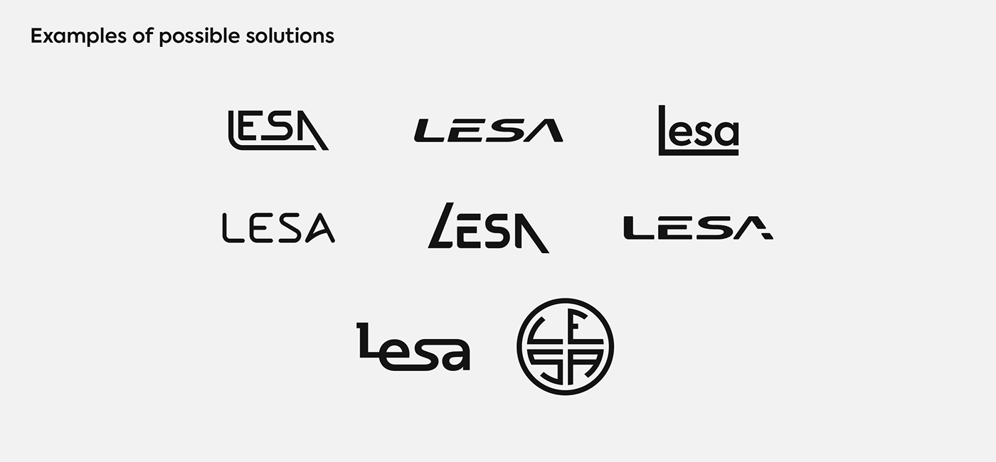
The same as it appears on paper, I keep working on these ideas in Illustrator, refining them
until I have something I can call a solution, or can I? Take a look below to see for yourself.
until I have something I can call a solution, or can I? Take a look below to see for yourself.
After a while, I settled on an idea that included starting with a font that I could
also use as brand typography and on which I could expand.
Again, the intention is to keep things as simple as possible.
also use as brand typography and on which I could expand.
Again, the intention is to keep things as simple as possible.
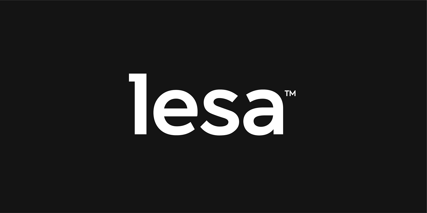
Font used for base is called Axiforma, if you are wondering it's not my favorite,
but it's a very beautiful, elegant, simple and modern font, check it out!
but it's a very beautiful, elegant, simple and modern font, check it out!
Also below in you can see that refining process every logo, icon or mark I make.


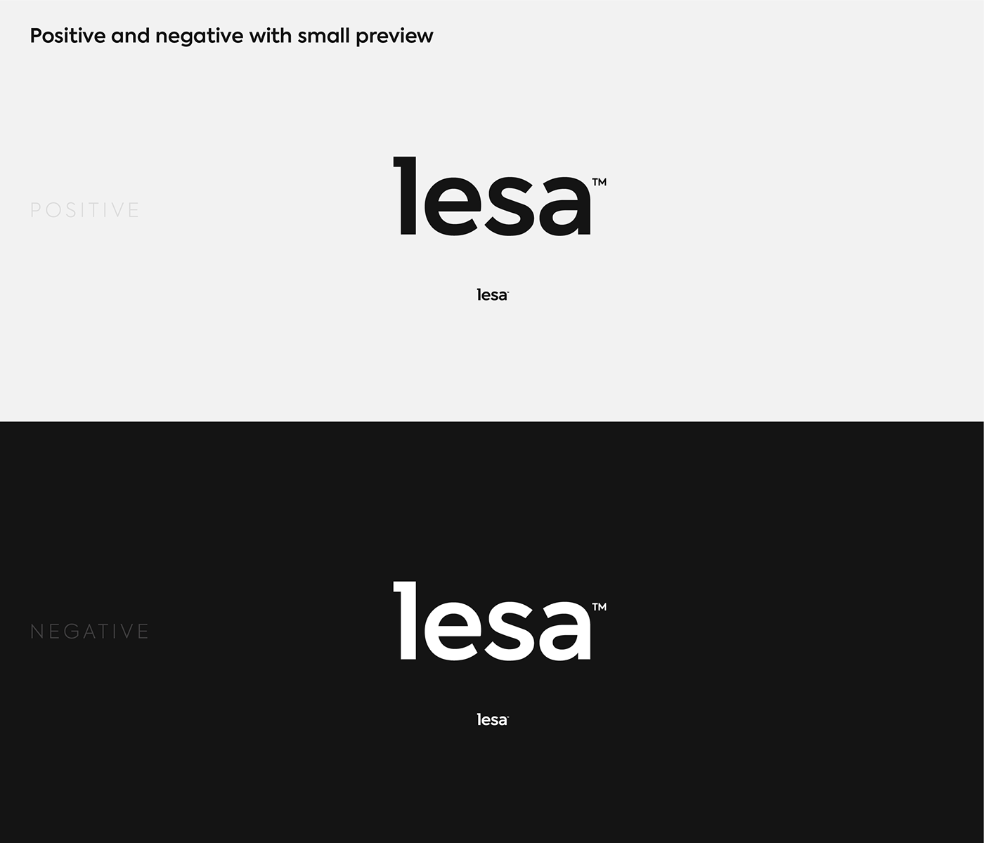
Because the logo is intended to be kept simple, I wanted no color. In fact, it has a kind of color for its main version, but some color experiments were required if I ever wanted to branch it out. And I do wish to branch out with time, as I said it will be ongoing, who knows where it will lead me.


In terms of my use of paper for logos, I always use sketching for ideas,
but I also use paper for other graphics or animations when I feel like it.
but I also use paper for other graphics or animations when I feel like it.

The aim of the animation was to be able to incorporate any color
from the previous color exploration while remaining simple.
And with some masking, I was able to obtain the color pleceholder.
In this form, it could even be used as an intro to a YouTube channel or a Reels intro, or whatever comes to mind.
from the previous color exploration while remaining simple.
And with some masking, I was able to obtain the color pleceholder.
In this form, it could even be used as an intro to a YouTube channel or a Reels intro, or whatever comes to mind.


When it comes to typography, the font was already chosen because it served as the groundwork for the logo.
I wanted to investigate potential use cases and have already established font sizes and styles to ensure maximum consistency across the board.
So the starting point was to create a full set of paragraph styles for future Website use, as it can be used anywhere but will always be most visible on the web.


...
You made it to the end, and for that I thank you; this was no easy task, as it is a lengthy post, but you did it.
Thank you very much once more; I hope you enjoyed it.
I would love to hear your thoughts on this project, so please leave a comment below.
Keep creating and be inspired. <3
...


